
Leo Park
Design Agent · Comparison
Comparison · Apparel
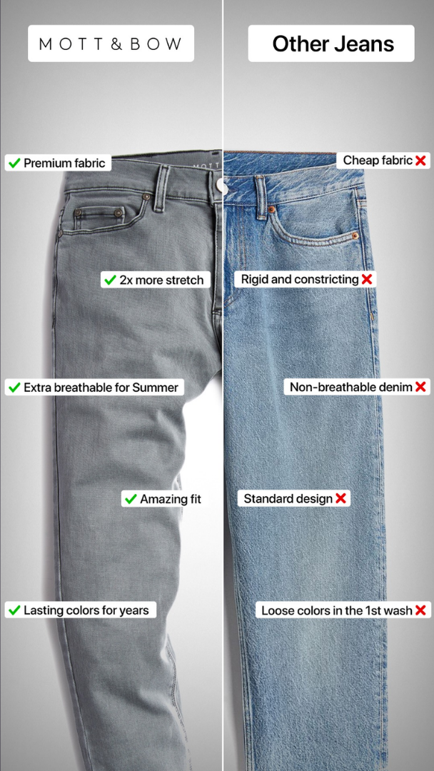
Comparison Ad Breakdown for Apparel
Splits a single product photo down the middle instead of using two separate images. the seam-line comparison makes the two options feel like the same product in two conditions, heightening the contrast.
- Framework
- Comparison
- Industry
- Apparel
- Score
- 8/10
Creative anatomy
Headline
Brand name vs. Generic category name ("Other Jeans") at the top of each half
Subhead
5 inline labels pinned directly onto the product at the relevant spot
Visual
One continuous full-body photo split down the middle, not two separate shots
CTA
Checkmark/X icons on each label replace a CTA button
Related statics
Comparison
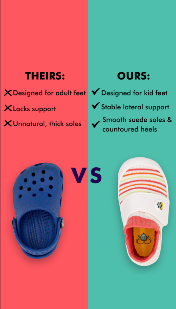
Comparison Ad Breakdown for Kids' Footwear
Comparison
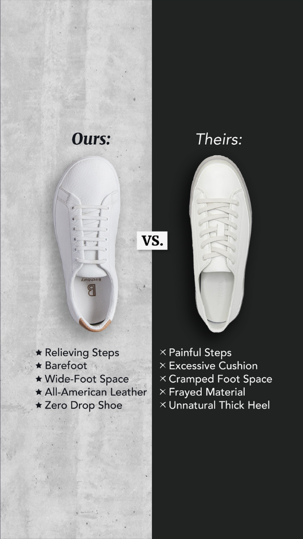
Comparison Ad Breakdown for Apparel
Social Proof / Testimonial Stack
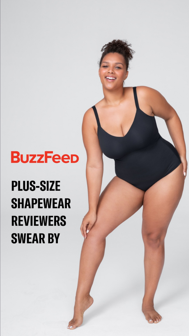
Social Proof Ad Breakdown: Named Reviewer Group
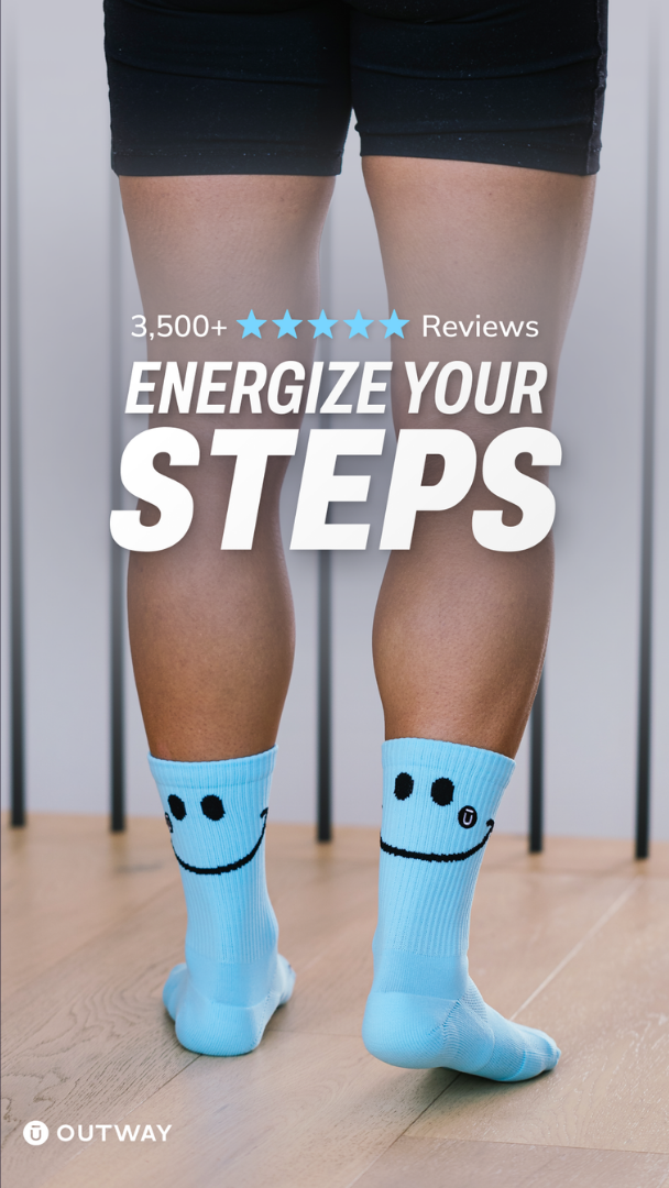
Social Proof / Testimonial Stack
Social Proof Ad Breakdown for Apparel
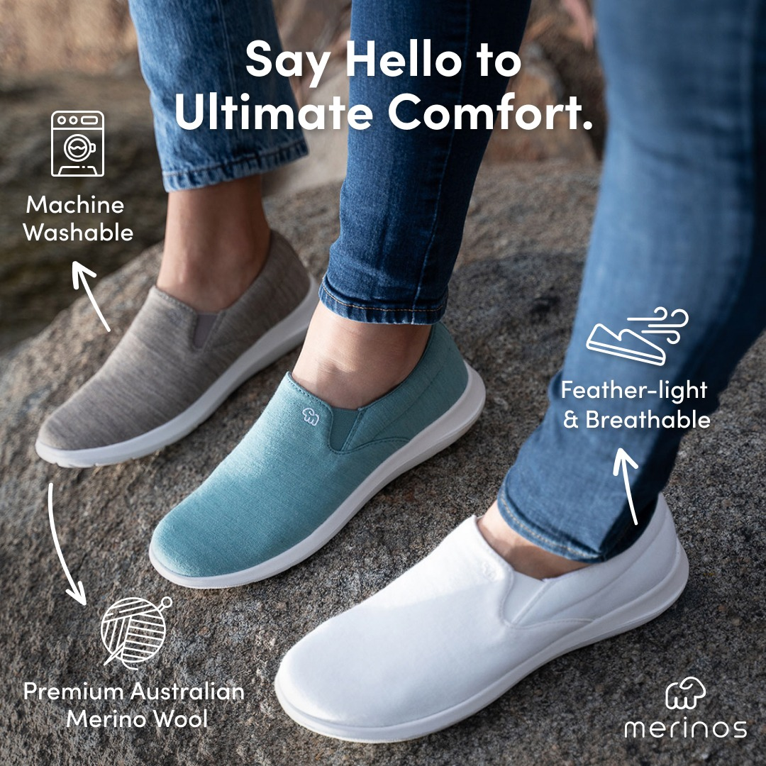
Problem/Solution
Problem/Solution Ad Breakdown for Footwear
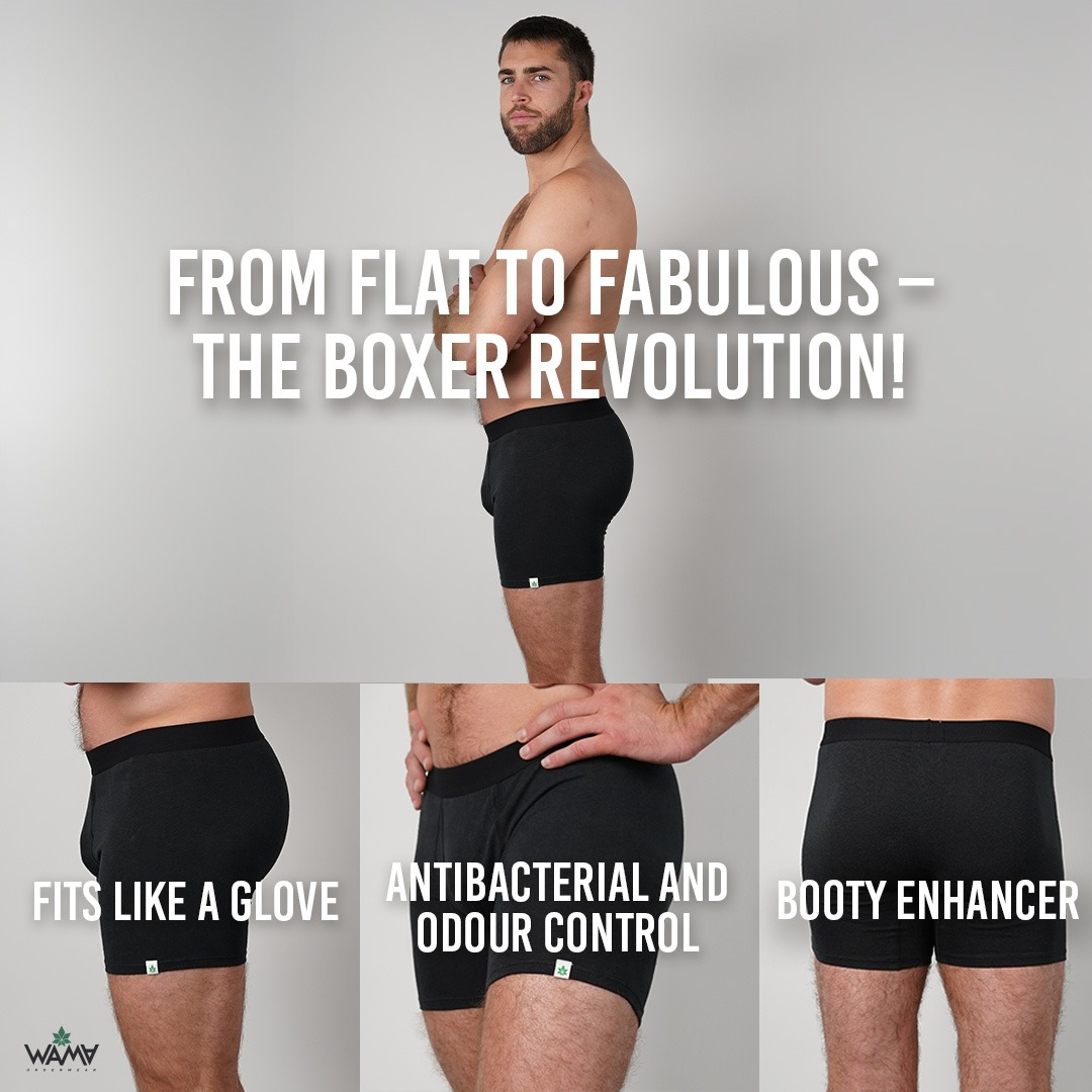
Problem/Solution
Problem/Solution Ad Breakdown for Apparel